Type-Facelift
Typography —
A change of style.

Getting back into writing gave me the perfect reason to do a thing I planned doing for a long time: Updating the typography of this very site.
Goodbye, Adagio
Since its release 2015 I’ve used Adagio_Serif; drawn by Mateusz Machalksi, published by the Borutta type foundry. It is also what I used it in my Keynote template, letters, basically everywhere.
It is a font I like very much. The ink traps, the friendly character, the high legibility. Paired with the slab and sans versions its applications are basically limitless. At least for the kind of design I do.
But still, after 4 years it was time for a change.
The update
For some months I have been pondering the idea to update the fonts I use. I leaned heavily towards a script font for the headlines. Liebe Fonts obviously comes to mind.
But over the last months there were two stand out releases of typefaces, which I couldn’t ignore. Lautsprecher and Bridge.
Lautsprecher
Actually, Lautsprecher was first released almost one hundred years ago. It was published in 1931 and originally drawn by Jakob Erbar. Erbar also drew Erbar-Grotesk, one of the first geometric sans serif typefaces. And one of my favourite ones.
When David Jonathan Ross announced that he has revived another one of Erbar’s fonts I was stoked.
It took one look at Lautsprecher DJR and I fell in love. There is something deeply wonderful and joyous about this font. The quirky combination of a script with the underlying sans foundation. The slightly weird uppercase S and the uppercase N.
It is something beyond words that makes me love the typeface.
Bridge
A short while after Lautsprecher, TypeMates released Bridge Text (accompanied by Bridge Head); drawn by Mona Franz.
And, again, it was love at first sight. It’s readable, but has beautiful details – just look at the uppercase R, or the lowercase k. It’s fun to read and reading has to be fun.
Along with the updated typefaces I made some small adjustments to the font sizes and overall layout. I’m happy with the result and look forward to tweaking it even further.
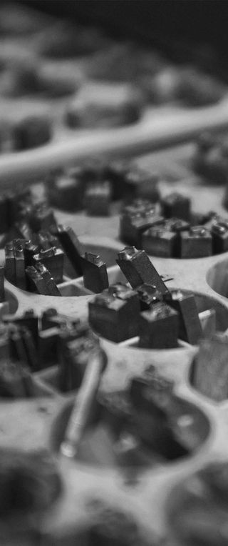
The title image has been taken Rodney Truitt Jr.
0 Webmentions
0 Likes
0 Reposts
Using Webmentions and webmention.io.